Showing posts with label Written by Jack. Show all posts

Thursday, 1 March 2012

Evaluation: Jack's Essay

(1) In what ways does your media product use, develop or challenge forms and conventions of real media products?

We used ideas of real media products in the sense that our video contained similar features to those of real ones. In the beginning stages of the project, we conducted a questionnaire as part of the research, in which we asked a sample of people from our target audience (teenagers) a range of questions, including motifs they like to see, what their favourite genre is, and so on. Using this information, we recognised what to include in our video to not only meet the needs of our target audience, but also to be similar to real media products. We used motifs in our video that are commonly used in real media products, such as fragmentation of the body, concert footage, and flashbacks to the past. In addition to motifs, we also used a diverse range of camera shots and angles that are used in real music videos to portray the different parts of the video, for example, a high-angle shot to show the inferiority of the man. In addition, our product uses a similar structure to real media products in the way that there is a clear narrative story that it follows from the beginning to the end, however, at the same time, it also differs from real narrative structures where there are breaks in the narrative in which we see concert footage.


Top: Fragmentation of the body in our video.


Bottom: Fragmentation of the body in Flo Rida's "Wild Ones".


Our product also differs from real media products. Real media products usually make people want to be like the artist they are representing, and live a life similar to theirs. However, our product steers away from the idea of wanting them to be like the artist, because people will not want to find themselves in a similar position to our artist. Despite this, they still feel our artists’ pain and can relate to his story/the video because the story in it is one they may have found themselves in, or could possibly find themselves in.  Another particular difference is the use of location; in our video, the main location is just an ordinary park that anyone would find themselves in, however, in real media texts, the locations used  would be more exotic and desirable, which ties in with the above statement that people will be able to relate to the video because it is set in a place used by them.


Top: The depressed character in our video, in an ordinary park, that our audience can relate to.


Bottom: Happy characters in an exotic location surrounded by company of the opposite sex in The Wanted's "Glad You Came" - something our audience would aspire to be like.


(2) How effective is the combination of your main product and ancillary texts?

I feel that the combination of our main product and the ancillary texts is very effective, as they all come together to promote the band. The video, obviously, provides the chosen song with supporting material that allows it to be played not only on radio, but also on television, in cinema adverts, and so on. This gives the video, and the song, plenty of opportunities to be promoted and addressed to people, particularly our target audience. Promotion is also a key part of the whole project, and supporting the video is the 3 ancillary texts we produced, all of which promote our band in a very professional, industry-like manner; the radio spot allows people to hear a sample of the song, which will then make them want to hear the whole thing and consequently view our video; the CD cover promotes it as though it were being sold in a retail store, so people would, were it a real product, see it in shops and be attracted to it, hopefully wanting to buy it; lastly, the website gives people all information they need to know about the artist and has on it the above products.


Another effective factor about all of our products is the consistent theme in them. The video is, as previously mentioned, about a man who is looking back upon a past relationship and being reminiscent of it in the hope that it will be rekindled, which therefore gives off a sort of depressing/nostalgic mood. To co-incide with this mood, we decided to use a black and white colour scheme in them, as black is a dark colour that would typically be associated with depression.


Top: Black and white in our video.


Bottom: Black and white in firstly the CD cover (front part) and the website (navigation bar).


(3) What have you learned from your audience feedback?

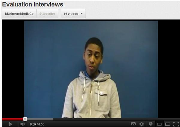
Having completed our video to what we feel was a very sufficient standard, we then had to evaluate it. A key part of this evaluation was the audience feedback because, after all, if the video isn’t appropriate for/approved by our target audience, then essentially it is pointless because it doesn’t meet its purpose. In order to gain an idea of the audience’s opinions of the video, we, firstly, carried out a test audience video in which we should 5 teenagers the video and analysed their reactions, and we then interviewed another sample of test audience people (as shown in the image below). Secondly, we created a survey and requested that people fill it out upon watching their video. Again, once a sufficient amount of people had filled out the survey, we analysed the results, which allowed us to recognise the strengths and weaknesses of our video.

We found that our target audience felt that our video portrayed a clear narrative that was easy to understand and follow, and we feel, as a group, that this is one of the most important things about any music video, whether it be real or for project purposes, as it keeps the audience engaged and makes them want to find out what happens at the end of the narrative story. Also, 87.5% of the people that filled the survey out said that they think the video fulfilled its target audience. This too, is a highly important factor because, as previously mentioned, if it didn’t, we wouldn’t be meeting their needs and therefore the video would have no purpose.

A weakness that was mentioned, and we agree with, was the lip-synching. Although it was in time in some places, in others it was very weak and was slightly out of time on a few occasions, as highlighted by the responses from this survey.


(4) How did you use media technologies in the research/planning, construction, and evaluation stages?

Media technologies were used in every stage of our project. Without them, we wouldn’t have been able to do anything, and there would be no project, because it is impossible to manually/hand produce what we had to.

The main technologies that were used are the Mac (computer), the camera, and Adobe Premiere. The Mac was the source of everything; it had everything we needed and everything related to our project saved on it, and was the place on which we edited the video, uploaded the clips, created surveys, put together the blog, so if we didn’t have a Mac, we wouldn’t have been able to do any of the above. The camera was the second most important piece of technology used because it’s what we used to film not only the actual music video itself, but also the interviews, any podcasts, etc., and so without it, no filming would have been able to commence, and therefore no videos would have been produced. The third most important piece of technology was a piece of software called Adobe Premiere. The product that took priority within the project was the music video, as this was the sole purpose of the project, and without Premiere, we would have no video, because we wouldn’t have been able to edit it by piecing it together and applying all the effects.

In the light of the above question, we essentially used technologies to do the project, and without it, there would be no project; we used them to make the video and all ancillary texts, to create surveys, to make interviews and podcasts, to do all of the research and planning (which was done using the ‘Celtx’ software), and to then upload all of this to Blogger in a presentable fashion.


Top: A Mac computer.


Bottom: A video camera similar to the one we used throughout the project.


Wednesday, 22 February 2012

Evaluation: How Does Your Project Challenge Real Media Texts?

Our music video is both similar and different to real media conventions, i.e., real industry created music videos, thus making it a unique media text that has aspects of both modern videos, and our own approach to the idea.

It is firstly different to real media conventions in the sense that our artist isn’t idolised – real music videos often contain a heavy use of materialistic mise en scene, with features such as expensive cars, lots of female/male attention (dependent on the artist), idealistic locations, parties, and so on, and teenagers (our target audience) will often find themselves wanting to lead a similar lifestyle and be able to have such things, and will therefore idolise the artist and aspire to be like them. Our video, however, sees the artist in a state of nostalgia and depression (as shown in the differing mise en scene – a picture, dull clothes, etc.) reflecting on his past life which was good, but his present one isn’t so great.  Teenagers will not want to be like him because they won’t want to find themselves in his negative position, and that is the pivotal point of our video that makes it differ massively to real music videos. However, despite them not wanting to be in his position, they will still be able to relate to the story and feel his pain, as it were, because it is likely that such a situation could possibly arise in their own personal lives. Therefore, they will relate to/communicate with our artist in such a way that will make them want to watch the video and take an interest in it.


Above: These images show the difference in the previously mentioned things. The first two are are of materialistic/idealistic things that are presented to teenagers in music videos, and things they would want to have - fast cars, lots of attention from the opposite gender, amongst others. The third image is from our video - the only possession our character has is the picture of his ex-lover, which represents reality in a sense, as what they have is minimal as opposed to what they want.


Another key thing to note is the location – as aforementioned, locations used in music videos are typically exotic/out of the ordinary; places in which teenagers would love to find themselves, leading a life of wealth and happiness. However, the location of our video is a park – just an ordinary public park that is used by many people. This is effective in a way because it increases the sense of reality within our video, whereas real media texts make overly materialistic things seem easily reachable, when they are infact unrealistic for their target audience. The use of this location ties in with the previously mentioned relation to the artist – anyone in the world could find themselves in a park (as they are used regularly for both enjoyment, and escaping things you don’t want to face), feeling the way he does, where as only a certain amount of people can actually afford to find themselves in the materialistic idealised places that are portrayed in real media texts.


Above: These images show the differences in location. Again, as with the above, the first one represents exotic and desired locations beauty and wealth, which is where teenagers would like to find themselves. The one below - a screenshot from our video - shows the location of a park, and again is a representation of reality as it is a realistic place in which our target audience would potentially find themselves regularly, which therefore adds emphasis on the way in which they can relate to both the artist himself as well as the overall video/narrative.

Again running with the idea of relating to the artist, the character of our video is represented in a light that can be associated with our target audience – he isn’t presented as a poor person with not much to live for, nor is he presented as someone who has loads to live for – he is just an ordinary person finding himself in an ordinary position, which makes our video relatable and approachable for our audience, unlike real music videos.
Above: These two images show the character representation of characters in real media texts, and then our own. The top image shows the band at a live performance, and it is undoubted that the crowd/audience would like to be like them, look up to them, and want to be in their position - so the characters are represented in a light that has them being idolised. Our video, however, as supported by the bottom image, lacks this - the only thing our character has is people mocking him, and the audience wouldn't want to be in his position/idolise him. However, they would still relate to it, as it is a realistic scenario and could occur in their own being.


Another last way in which our text differs to real media ones is the narrative. Although our video does follow them in the way that there is a clear story-line, the narrative is in some parts fragmented, unlike real videos. The reason why we fragmented the video was to momentarily take the viewers away from the main action in order to keep them wanting to resume watching it and find out what happens at the end of the narrative, or the end of the 'story'. The main way in which our narrative is fragmented is with the use of concert footage, as shown in the image below.


 Despite the above, we feel that our music video is also similar to real media texts in the way that it uses special effects and has a linear narrative that is easy to follow. However, with the inclusion of the above differences, we feel that it is a unique piece of media text.


Written by Jack.


Sunday, 5 February 2012

Evaluation: Test Audience Interviews


For further constructive criticism, we decided to interview a sample of people from our targeted audience. We decided to interview different people to those in the initial test audience video because it would give us a wider range of opinions, and therefore a broader idea as to how successful the overall project was.

Written and interviewed by Jack.
Video edited by Tyrone.

Evaluation: Test Audience

Using a test audience is vital in any media production. The purpose of using them is to get feedback about your media product from the target audience that it is aimed it - this is the best sort of feedback to get, as it allows the group to know whether their product was successful in fulfilling its aim of attracting that particular audience. If the feedback is negative, then it is more than likely that the product didn't cater for that particular audience properly, however, if it is positive, then the product has evidently been successful. For our video, we asked a group of fellow 6th form students to view all of our products, as they are part of the teenage audience that our multimedia package is aimed at. We decided to use the selected people because we are close friends with them, and therefore, knew that they would be totally honest with their opinions and reactions, whereas people we don't know may have felt obliged to be polite and not laugh/overly criticise it etc. 


Written by Jack.
Video made by Tyrone.

Evaluation: Attracting The Target Audience

In order to attract our target audience, we posted our video to social networking website Facebook, and also YouTube, reason being that these are two extremely popular websites that are used massively by teenagers (our target audience) on a daily basis, and therefore, posting the video on such sites would give them easy access to it. 

The images below show evidence of all of us posting a link to firstly our video, and also the survey requesting people to watch it and then complete the survey to give us feedback, and evaluate it from a secondary basis, enhancing our own personal evaluation of it.


 The image below shows our video uploaded on YouTube. As you can see from the amount of views, publishing it to this website allows for easy viewing and makes the video readily available for not only the target audience, but anyone, to view at any given time.


Written by Jack.

Monday, 28 November 2011

Construction: Analysis Of Shots Used

The series of images below show examples of the various types of shots that we have used within our music video, and an explanation as to why we have used them. 

Above: This image shows a close-up shot. We have used these on a few occasions to show the artist's expression which consequently allows us to see how he is feeling. In this particular example, the fact that his eyes are closed and  his head is pointing slightly downwards, show that he is deep in thought - he is thinking about his ex-lover and being nostalgic about their past together.

Above: This image shows a high-angle shot. This kind of shot is very effective because, as shown in this example, the camera points down on the subject to show their dominance within the narrative - although the character isn't inferior to any other people, the use of this shot shows that he is of a vulnerable and saddened state, due to the way he is feeling. The fact that people are looking down on the subject shows that they probably think less of him, and think he is somewhat deluded and pathetic because what he is doing (waiting for a girl/refusing to move), and hopes to achieve out of doing it (rekindling their relationship) doesn't seem very realistic. This adds to the severity of the inferiority within the video, and allows the audience to grasp how he is feeling.

Above: This image shows a medium shot. We have used these quite regularly, as they are a very popular shot in all types of videos. We have used it so that the viewers can focus on the character and what he is saying/the emotions he is expressing, but can also simultaneously see what kind of set and props are being used to add to the feeling that is being evoked. In this example, it is obvious that he is sitting down on a bench, which coincides with the lyrics and how he refuses to move. In terms of props/mise en scene, he is wearing a grey top - grey being a colour typically associated with dullness, which adds to the mood given off in the video.

Above: This image shows a pan-right shot. We have only used this once at the very beginning of the video. We decided that it would be appropriate to use this shot, followed by a tracking shot following the subject, because it allows the viewer to absorb everything necessary - the surroundings, to see where the video is going to be mainly set, and it allows them to feel as though they are actually there with the man, walking with him, which adds to the reality of the video, and therefore allows them to realise how realistic and deep his feelings are.

Above: This image shows an over-the-shoulder shot. We decided that this would be effective to use to go with the lyrics "got your picture in my hand" - using this type of shot would give the viewers a clear view of the picture and allow them to clearly see what it is of - in this case, his ex-lover. Using this prop again allows the viewers to realise how passionate he is about the relationship he once had, and how much he misses her ex-lover. This therefore adds to the depressive mood that is evoked.

Above: This image shows a wide shot, and they have been used on quite a few occasions in the video. As with the medium shot, it allows the viewers to focus on the character(s) and what he is saying/the emotions he is expressing, but also to be able to see everything else that is going on in the video that is key to the main action.


Above: This image shows a low-angle shot. We used this in the scene that involved the police-officer, in order to show the authority that he holds over not only the man in the video, but the public and its people as a whole. This shot is particularly effective as it allows the viewers to recognise the authority of this figure, and the way that he is looking down on the man on the bench depicts how the man is feeling vulnerable and perhaps scared.

Above: This image is of another close-up shot. However, this particular one has been used in a different style to the others. With this one, I held the camera with my hand, and manually walked round the man. Originally, I filmed this shot with no intention of actually using it, and instead thought I would just do it anyway as it is different to the rest of the shots. When editing, Tyrone incorporated it to see what it would look like, as there was an empty section of the video which needed to be filled up, and we decided that it looked quite effective and hence decided to use it. 


Above: These two images show the use of a zoom shot. We have used these on a few occasions within the video because they focus on a particular part of the video that we, as the directors, want the audience to focus on, and it therefore allows them to do so. The one above has been used at the end of the video where the man's ex-lover gets to the corner, but he has gone, and all she sees is the picture of her on the bench. The first image is of the picture when she first seems it, and the second is of when it is zoomed in on to allow the viewers of the video to really absorb it and recognise the motif of the video, i.e., that upon being forced to, the man leaves, at which point the woman turns up.

Written by Jack.

Construction: Proof Of Organisation

The images below show our organisation as a group, and re-infornce the previous vlog we made about organisation within the group.


This first image is of our desktop. We only have the one folder on our desktop, in which literally everything we need is stored. This means that we know where everything is, and it isn't all scattered over the desktop, which would make it extremely messy, and therefore hard to find what we need.


This image shows the videos within the one above. We have made 4 individual folders which are clearly labelled and we therefore know what is contained in each of them. "Premiere Projects" contains all of the videos we made in their premiere un-encoded formats, such as our interviews and the actual music video itself. "Videos" contains all of the vlogs we made on Photobooth, and also the exported, coded videos that we made on premiere and put onto YouTube and this blog. "Presentations" contains all of the powerpoints we made which have been put on here. "Other Stuff" contains everything else we used within the video, such as pictures and music clips.


The screen shot above shows how we knew what we had to film on each of the filming days. We went through our premiere project and made note of the lyrics that we hadn't filmed a clip for, and then next to them wrote what we were going to film to aid these lyrics. Doing so meant that we could print the filming plans off and take them to the different days, and once we had met, we knew exactly what we had to do, and could get it done in a shorter space of time as we didn't have to improvise on the spot.


Written by Jack.

Construction: The Importance Of Consistency

When creating our project, it is highly important that we keep everything consistent with a matching house style. By this, I mean that the CD cover and website should be similar in the use of colour etc, in order to match the mood of the video and express the image we're trying to create for our artist.


When I created the website, I used a black and white colour theme, firstly because they are two colours that strongly compliment each other well and looks good on the page. Also, although it is not always the case, people typically associate black as a colour that evokes a sense of depression and dullness, which is the key motif in our music video - the man is in a state of nostalgia, and has depressive feelings about his past memories with an ex-lover. This choice of colour is highly sufficient in the way that it matches the mood being given off in the video, and this mood is maintained through the other promotional material. After I'd created the website, fellow group member Tyrone viewed it to gain an idea as to what sort of style to use with the CD cover. Again, he used a black background with white text in order to stabilise the sad mood emitted in the video, and a black and white effect was applied to the pictures he used in order to match the 
website, and also the video.


In future filming sessions, we are going to be filming clips of the man and his ex-lover in the past, where they were a happy couple. As we did with the pictures (see above), we are going to apply a black and white effect to these clips, not only to show that they are moments from the past, but also to insinuate that he is being saddened by the recollection of them.


To conclude, we feel that using a consistent black and white theme throughout our promotional materials gives off a sad image about the artist, and hope that the viewers will feel a sense of pathos towards him (pity), which will consequently make them want to view the video, and also the other features of the promotional package, repeatedly.


Written by Jack.

Construction: Podcast 6 - Dividing & Deciding The Work Load


In the video above, I explain our reasonings as to the distribution of the work load and how we reached these decisions as a group, and how it effected us in the long run.


*Note that I was meant to say 'when I was in the video...Tyrone filmed', not 'Tyrone edited'*.


Video and blog entry by Jack.

Construction: Podcast 5 - Filming & Editing Analysis


In the podcast above, Me, Tyrone and Sid analysed the project as a whole and discussed how we felt that it went. I personally touched on the filming side of things, and Sid talked about the editing side of the project. Sid then discussed the continuity to finish off the video, and how we made the project realistic through the use of different weather conditions and different lengths of here, which we feel emphasises how the man is refusing to be moved, and therefore adds to the nature of the video. 


Written by Jack.

Construction: Podcast 2 - 2nd Progress Update


This is another quick podcast in which me, Sid, and Elliott explain how we plan to continue carrying out the project throughout the upcoming school break.

Written by Jack.

Wednesday, 23 November 2011

Construction: iWeb Demonstration (Website)

The core part of the specification is that, as well as the music video, we have to create a promotional package that highly promotes the new song and video. This package comprises of a CD cover, a radio spot, and a website. We split each of these equally, and reached the decision that I would do the website, Tyrone would do the CD cover, and Sid and Elliott would work together to produce the radio spot. I decided to create the website first, as I was already familiar with the software and would therefore be able to get it done in a quicker amount of time.

The first thing I did was open the program 'iWeb', upon which the content in the screenshot on the left appeared on the screen. Once here, I had to create a new website by going to File > New Site, and then named it and selected a place/server for it to be saved on.


Once I had established the website, I had to choose a theme to use. I chose the plain black theme, as I felt that black and white are the 2 colours that compliment each other the most, and would look most attractive to the audience.


I then had to add all the pages before I could actually begin working on them. To do so, I followed the steps I had previously followed to create the website, but this time clicked on "New Page" as a pose to "New Site". I done this the necessary amount of times, and then renamed the pages. I could now begin working on them.


The elements that I used in the website are text, video, shapes, and pictures. Below I have explained how I incorporated each of these, and on which pages.

Above: Text was added by clicking on the "Text box" button  on the panel at the bottom of the screen. I then simply typed out the text that I wanted to be displayed, and then customised it to suit my desired needs. This was done by clicking on the "Fonts" button on the panel at the bottom, which brought up the window shown in this screen shot. Here, I selected the font face, colour and size in order to alter the appearance of the text to what I wanted it to look like. It was highly important that I showed that the website was being made for educational purposes only, and that no copyright was intended. To do so, I used the text tool, and placed a text box that said "For educational purposes only." at the bottom of each page - as shown in the screenshot below.

Left: In order to add a picture, I had to firstly locate it on the computer, and then open the folder in which it was, bringing it to the forefront of the open programs. I then selected the picture that I wanted to be on the page. Then I just simply dragged it over to the page, and then, on the release of the left-click button on the mouse, it appeared there. I then altered the size of it using the four squares in each of the corners, and aligned it accordingly.


 Right: In order to add a video, I selected the "Widgets" tab on the panel on the right hand side of screen, and then clicked on the "YouTube" one. As with the picture, I then dragged and released it, upon which a blank square with the YouTube logo appeared on the screen (see picture). In order for the video I want to be displayed to be shown, I had to retrieve its URL > paste it into the box headed "YouTube URL" > Click on Apply. 


The picture above shows the 2 videos that I have already uploaded to the website: the introduction to our group, and the radio promotion that Sid and Elliott created. These videos will be accompanied by the finished product, i.e. the music video, at a later stage.

Left: Another feature I decided to include was a countdown, which I put on the "Events" page to mark the countdown to the next 'tour' of our 'band'. As done previously, I clicked on the "countdown" picture on the Widgets panel, and the dragged it onto the page. I then customised the settings to the desired date, which then changed the digits on the countdown.


One issue that I often encountered when creating the website is that the size of the pages had been set to pre-defined measurements, and at times, I wouldn't be able to fit all of the content on the page. In order to resolve this issue, I had to click on the 'inspector' button on the panel at the bottom of the screen, and the window shown in the screenshot below appeared on the screen. Once here, I clicked on the 'Layout' section, and altered the number in the boxes that said "content width" and "content height" accordingly. I increased them to give me more room, which allowed for more things to be placed on the page. 


Written by Jack.

Construction: Lip Sync Introduction


The video above shows the lip-syncing in practice.

Presentation and blog post made by Jack.

Tuesday, 22 November 2011

Construction: Issues With Filming - 2

On two occasions - Monday 19th December and Tuesday 3rd of January -  we decided to film the next part of our music video. We decided to meet at 1 p.m. outside central park, as this time and location was suitable for everyone. Prior to actually meeting, a change in weather conditions (heavy rain)  meant that the chances of us actually filming were being reduced. However, we decided to meet at 1 regardless, and hope that the rain die down in order for us to resume with our original plans of filming. We waited for 30 minutes in hope of a change in the weather, but the rain just got worse, and we decided to postpone the filming for another day later on in the holidays.


Although rain would be suitable to suit the mood of our video, as it evokes a sense of depression and dullness, the footage we have previously filmed was shot when it was relatively sunny, and the different weather conditions would cause inconsistency within the video, and it would therefore be profoundly unprofessional. 


This error can't be helped, and is no fault of our own, so we will have to just be patient and wait until the weather gets better in order to film. In the approach to christmas, we are all working a lot, and have a lot of coursework to catch up with for other subjects so, as a group, we have decided that it would be better to film nearer to the end of the holidays/at a later stage when we are all working a lot less, and will therefore have more time to dedicate to filming.


Written by Jack.

Construction: 7th Day Of Editing

Today, after we had finished the filming session, I, Jack, decided to go back to school and use my spare time wisely and carry on with the editing process in order for us to meet the final January deadline easily and surely.


I spent, in total, five hours (11 a.m. - 4 p.m.) in the computer room working on the project. The reason why I had spent such a long amount of time doing so  is for a couple of reasons; firstly, I encountered a few problems - when I plugged the camera into the computer to upload the footage onto it, the files were not there due to the settings on the camera - the camera had been formatted to process the clips as .MOD files, but someone who had previously used the camera changed the option to .MPEG files. This was a repetitive process, however, because at first I kept trying to re-plug the camera in the computer, until eventually I got help from my teacher. 


The second reason why I spent so long is that the editing is that the editing has to be as precise as it can be. Once I had converted each individual .MOD file to a .MPEG and put them onto Premiere, which in itself is a lengthy process, I had to sort through them all and make sure all the ones we needed were there, getting rid of any un-needed ones. I then had to begin piecing them together; this took a lot of time as the miming in the clips has to be match the lyrics of the actual background song as precisely as it can, in order for it to look as realistic as possible, and as though the man (Sid) was actually singing it. This took a lot of adjustment and cropping, and on many occasions I had to delete the clip and start again until it was as close as I could get it. For some unknown reason, a couple of previously edited footages had disappeared, which added to them time spent editing because I had to do the above to these again. 


The software I used in this part of the editing process was Adobe Premiere, and the tools I used to do so are as follows:
- razor tool: this was used to cut the footage to the correct length, and to cut clips into different pieces (if needs be).
- cursor tool: this was used to select footage and move it along the timeline, as well as placing it in the correct position on the timeline.
- brightness tool: this was used to adjust the brightness of some of the clips so that they matched the others in order to maintain consistency, due to them having been shot when the weather was slightly overcast.
- effects panel: this was used to select, and then apply, effects onto the different clips. The effects I used were:
1. 'Black and white' - I used this to show that particular clips were memories of past events (time the man had spent with his ex-lover when they were together) and to represent his nostalgia.

2. 'Dip to white' - I used this to mark the end of one scene and the beginning of another so that they flowed together and one didn't just abruptly appear after the another with a change of setting.
3. 'Cross dissolve' - I used this to a similar sort of affect as above, but instead of the screen turning white to indicate the end of one section and the start of another, the new clip faded in as the finished one faded out.


Other than the aforementioned problems, no others were encountered. Once things were flowing and I had everything in Premiere and had began editing, I didn't encounter any problems as I was already familiar with the software due to past experience.


Written by Jack.