Prezi and blog post made by Elliott.
Wednesday, 22 February 2012
Evaluation: How Is Our Project Similar To Other Media Texts?
The final aspect which i have to compare is how our media Music video is similar to that of a professional music video. Firstly we looked to install originality into out project so a lot of the video does not hold many similarities as it is original work. That aside however we can draw similarities found in our music video that can be found in professional music artists work. The main similarity i was able to find from our video is a shot where my face is split into four segments in the video. We used this effect in the video as we thought it gave off a professional look to it. The four segment effect can be found in the work of such professional artists such as the band 'Gorillaz'. An example of the distinct parallel can be seen below:
Blog post by Sid.
Presentation by Sid.
 |
| The Album cover for Gorillaz's Album cover 'Demon Days' |
 |
| The still clip taken from our music video. |
Blog post by Sid.
Presentation by Sid.
Evaluation: How Does Your Project Challenge Real Media Texts?
Our music video is both similar and different to real media conventions, i.e., real industry created music videos, thus making it a unique media text that has aspects of both modern videos, and our own approach to the idea.
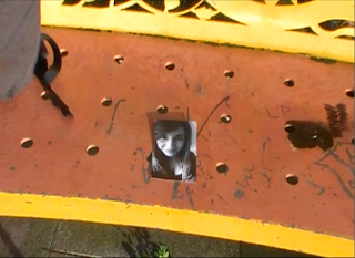
Above: These images show the difference in the previously mentioned things. The first two are are of materialistic/idealistic things that are presented to teenagers in music videos, and things they would want to have - fast cars, lots of attention from the opposite gender, amongst others. The third image is from our video - the only possession our character has is the picture of his ex-lover, which represents reality in a sense, as what they have is minimal as opposed to what they want.
Another key thing to note is the location – as aforementioned, locations used in music videos are typically exotic/out of the ordinary; places in which teenagers would love to find themselves, leading a life of wealth and happiness. However, the location of our video is a park – just an ordinary public park that is used by many people. This is effective in a way because it increases the sense of reality within our video, whereas real media texts make overly materialistic things seem easily reachable, when they are infact unrealistic for their target audience. The use of this location ties in with the previously mentioned relation to the artist – anyone in the world could find themselves in a park (as they are used regularly for both enjoyment, and escaping things you don’t want to face), feeling the way he does, where as only a certain amount of people can actually afford to find themselves in the materialistic idealised places that are portrayed in real media texts.
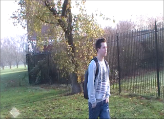
Above: These images show the differences in location. Again, as with the above, the first one represents exotic and desired locations beauty and wealth, which is where teenagers would like to find themselves. The one below - a screenshot from our video - shows the location of a park, and again is a representation of reality as it is a realistic place in which our target audience would potentially find themselves regularly, which therefore adds emphasis on the way in which they can relate to both the artist himself as well as the overall video/narrative.
It is firstly different to real media conventions in the sense that our artist isn’t idolised – real music videos often contain a heavy use of materialistic mise en scene, with features such as expensive cars, lots of female/male attention (dependent on the artist), idealistic locations, parties, and so on, and teenagers (our target audience) will often find themselves wanting to lead a similar lifestyle and be able to have such things, and will therefore idolise the artist and aspire to be like them. Our video, however, sees the artist in a state of nostalgia and depression (as shown in the differing mise en scene – a picture, dull clothes, etc.) reflecting on his past life which was good, but his present one isn’t so great. Teenagers will not want to be like him because they won’t want to find themselves in his negative position, and that is the pivotal point of our video that makes it differ massively to real music videos. However, despite them not wanting to be in his position, they will still be able to relate to the story and feel his pain, as it were, because it is likely that such a situation could possibly arise in their own personal lives. Therefore, they will relate to/communicate with our artist in such a way that will make them want to watch the video and take an interest in it.

Above: These images show the difference in the previously mentioned things. The first two are are of materialistic/idealistic things that are presented to teenagers in music videos, and things they would want to have - fast cars, lots of attention from the opposite gender, amongst others. The third image is from our video - the only possession our character has is the picture of his ex-lover, which represents reality in a sense, as what they have is minimal as opposed to what they want.
Another key thing to note is the location – as aforementioned, locations used in music videos are typically exotic/out of the ordinary; places in which teenagers would love to find themselves, leading a life of wealth and happiness. However, the location of our video is a park – just an ordinary public park that is used by many people. This is effective in a way because it increases the sense of reality within our video, whereas real media texts make overly materialistic things seem easily reachable, when they are infact unrealistic for their target audience. The use of this location ties in with the previously mentioned relation to the artist – anyone in the world could find themselves in a park (as they are used regularly for both enjoyment, and escaping things you don’t want to face), feeling the way he does, where as only a certain amount of people can actually afford to find themselves in the materialistic idealised places that are portrayed in real media texts.

Above: These images show the differences in location. Again, as with the above, the first one represents exotic and desired locations beauty and wealth, which is where teenagers would like to find themselves. The one below - a screenshot from our video - shows the location of a park, and again is a representation of reality as it is a realistic place in which our target audience would potentially find themselves regularly, which therefore adds emphasis on the way in which they can relate to both the artist himself as well as the overall video/narrative.
Again running with the idea of relating to the artist, the character of our video is represented in a light that can be associated with our target audience – he isn’t presented as a poor person with not much to live for, nor is he presented as someone who has loads to live for – he is just an ordinary person finding himself in an ordinary position, which makes our video relatable and approachable for our audience, unlike real music videos.
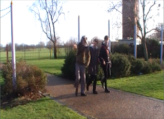

Above: These two images show the character representation of characters in real media texts, and then our own. The top image shows the band at a live performance, and it is undoubted that the crowd/audience would like to be like them, look up to them, and want to be in their position - so the characters are represented in a light that has them being idolised. Our video, however, as supported by the bottom image, lacks this - the only thing our character has is people mocking him, and the audience wouldn't want to be in his position/idolise him. However, they would still relate to it, as it is a realistic scenario and could occur in their own being.
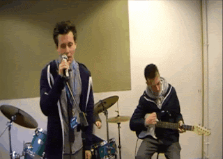
Another last way in which our text differs to real media ones is the narrative. Although our video does follow them in the way that there is a clear story-line, the narrative is in some parts fragmented, unlike real videos. The reason why we fragmented the video was to momentarily take the viewers away from the main action in order to keep them wanting to resume watching it and find out what happens at the end of the narrative, or the end of the 'story'. The main way in which our narrative is fragmented is with the use of concert footage, as shown in the image below.
Despite the above, we feel that our music video is also similar to real media texts in the way that it uses special effects and has a linear narrative that is easy to follow. However, with the inclusion of the above differences, we feel that it is a unique piece of media text.
Written by Jack.
Another last way in which our text differs to real media ones is the narrative. Although our video does follow them in the way that there is a clear story-line, the narrative is in some parts fragmented, unlike real videos. The reason why we fragmented the video was to momentarily take the viewers away from the main action in order to keep them wanting to resume watching it and find out what happens at the end of the narrative, or the end of the 'story'. The main way in which our narrative is fragmented is with the use of concert footage, as shown in the image below.

Despite the above, we feel that our music video is also similar to real media texts in the way that it uses special effects and has a linear narrative that is easy to follow. However, with the inclusion of the above differences, we feel that it is a unique piece of media text.
Written by Jack.
Sunday, 5 February 2012
Evaluation: Video Review
Having watched the above video, we gained some further constructive criticism from another member of the target audience. The feedback was a mixture of both positive and negative; it was said that we had overall done well and grabbed the whole concept, however, she said the locations we used were quite boring, because there wasn't much to edit due to the same constant scenery. Furthermore, she said that it was a good factor that we had a story, however, it could have been made stronger through better acting. In particular, she enjoyed the flashbacks, and the creativity within the greenscreen.
Taking into account all of the above, if we were to do the video again, we would improve it by perhaps using a different location, or doing different shots in different parts of the park and improved maybe the scenes that had the band rehearsing; we could perhaps organise them playing on an actual stage with a small crowd of people to make it seem more realistic. Another thing we would do was make the lip-synching more precise which would therefore making the acting more professional. Things we would keep the same are the use of special effects, the genre of the video, and the green-screening, as we felt that these things were quite strong, as did the above person.
Written by Jack.
Evaluation: Test Audience Interviews
For further constructive criticism, we decided to interview a sample of people from our targeted audience. We decided to interview different people to those in the initial test audience video because it would give us a wider range of opinions, and therefore a broader idea as to how successful the overall project was.
Written and interviewed by Jack.
Video edited by Tyrone.
Video edited by Tyrone.
Evaluation: Test Audience
Using a test audience is vital in any media production. The purpose of using them is to get feedback about your media product from the target audience that it is aimed it - this is the best sort of feedback to get, as it allows the group to know whether their product was successful in fulfilling its aim of attracting that particular audience. If the feedback is negative, then it is more than likely that the product didn't cater for that particular audience properly, however, if it is positive, then the product has evidently been successful. For our video, we asked a group of fellow 6th form students to view all of our products, as they are part of the teenage audience that our multimedia package is aimed at. We decided to use the selected people because we are close friends with them, and therefore, knew that they would be totally honest with their opinions and reactions, whereas people we don't know may have felt obliged to be polite and not laugh/overly criticise it etc.
Written by Jack.
Video made by Tyrone.
Written by Jack.
Video made by Tyrone.
Evaluation: Attracting The Target Audience
In order to attract our target audience, we posted our video to social networking website Facebook, and also YouTube, reason being that these are two extremely popular websites that are used massively by teenagers (our target audience) on a daily basis, and therefore, posting the video on such sites would give them easy access to it.
The image below shows our video uploaded on YouTube. As you can see from the amount of views, publishing it to this website allows for easy viewing and makes the video readily available for not only the target audience, but anyone, to view at any given time.
The images below show evidence of all of us posting a link to firstly our video, and also the survey requesting people to watch it and then complete the survey to give us feedback, and evaluate it from a secondary basis, enhancing our own personal evaluation of it.
The image below shows our video uploaded on YouTube. As you can see from the amount of views, publishing it to this website allows for easy viewing and makes the video readily available for not only the target audience, but anyone, to view at any given time.
Written by Jack.
Evaluation: Survey Monkey Questionnaire
This blog post will be talking about the questionnaire that was created using Survey Monkey to help us get feedback from people on our final product. Below is a screenshot of what the questionnaire looks like to the general public filling in the questionnaire.
The first question that we decided on doing was to summarise the video, and to make sure that the audience knew what was happening in the video. The question that followed was aimed at those who did follow the narrative, if it was easy to follow. And then to conclude with the closed answer questions, we wanted to know if the video fulfilled it's target audience. This was important to us as a group because our target audience where teenagers, and if the video did not fulfill the intended audience then we had a failed product.
Part of the coursework criteria was the use of special effects, so we wanted to know if the effects we used where suitable, and to have different peoples opinions on what effects worked well and why, and which didn't. A major issue we had when filming was the lip-syncing and getting the filmed clips to match up with the song, we needed to know from other peoples perspective if the lip-syncing flowed with the music, and in which areas it didn't.
Due to our video being zero-budget, we wanted to know if the set and props that we had used where believable, therefore we wanted to know peoples thoughts on the props we did use, and if they suited the video. The next question was not aimed at the video, but more at the song that we had chosen, and whether it is better to chose to do an older song in comparison to a more modern one, and we wanted to see the difference in opinion from person to person.
Our aim for the music video was to give off a nostalgic effect, taking into account the zero-budget and the new use of special effects programmes, we wanted to know if people felt that our video gave off the desired effect, and if not how and why. The final question was a simple matrix asking people to rate the lip-syncing, the special effects, the camera shots and angles and the final product.
Written By Tyrone.
Subscribe to:
Comments (Atom)


